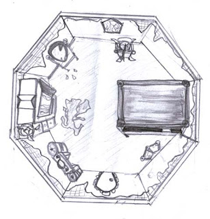
Friday 30 November 2007
Monday 26 November 2007
Last Scene of the Princess Bedroom
Wednesday 21 November 2007
First Scene_with sound and music experiment
I have used our first scene and added sound and music to it though premiere pro, I have experimented to get an idea of what sounds better. This isn't textured yet.
To listen you might need some head-phones
First Scene_with sounds_experiment
This sound blast only has sounds and not music add to it, this is a short experiment of our first scenes.
To listen you might need head-phones.
Sound Ideas
I was unable to put sound in the blog and have a person selected them, therefore I had to put them in a movie file and have titles with the sound playing. For this you need headphones:
Tuesday 20 November 2007
Prince
Monday 12 November 2007
Extra
I used the same mold on the dress just a different back ground texture, with this I wanted to find out what depth the bump tool should be on the princess dress, but I found that all three would have worked well, I like the one that is over bumped because it looked like a dress that has been rotted away for years. but because of the rendering scene I had to down size the bump.
I found that using photo shop become harder when I was dealing with fabric's, I tried to experiment with different ways to develop the fabric on both the cover and dress to look moldy and rotten. I used all types of designs in photo shop but in the end I had to have two layers one with the previous texture on it then with another layer colour and design on top of it:
Rendered scene in Maya8 of chosen texture:
using both layers I used green paint, textured design, cut and blur tools. I found that this didn't work on the rendered scene, because their was too much green and it didn't look realistic:
This one worked because it was very simple, I decided to keep to my old texture because it looked like fabric and then paint mold and copy an image from the Internet to make the mold look more real:
using the brightness and contrast levels to bring more depth to the bump tool:
using the filter tool I chose the blur effect to make the cover but I thought the colours might blend in together but it just looked over done:
Re-Textured Bedroom
Below are the textures I re-done, I used the same brick wall and imported it back into photo shop, where I used the contrast and colour to texture the different colours within the wall and then by using another layer I got an image of the Internet and burned holes into the wallpaper and used the brown colours to make the wallpaper look old and warn against the brick walls. I did the same with the carpet, using two layers and flatten them together I had a wooden floor appearing though the carpet, which was also burned and warn away.
After finishing of my Princess bedroom I went back and re-done the texture again on my furniture and the room itself. I used the original textures and put them back into photo shop were I tried to make the objects much older, by using the blur, cut, burn and eraser tools I was able to re-design my room, I added more images both underneath and on top of my first textured images to give a design of rotting furniture. I found that using photo shop could make the texture anything you wanted to do, since I wasn't as good on photo shop I experimented and found out how to use both programs and now I enjoy texture and being able to do so much with have a plan flat texture and building upon it in photo shop and bumping the images in Maya8 and making the images come alive and feel more realistic. I also learned how to use the filter affect giving the image even more depth by arrange an image to be a painted, cutting, blurred, filtered and other designs in the filter gallery.
Tuesday 6 November 2007
Textures Re-done
I designed both my bed and tower walls, the bed cover are pulled to much over the bed making the bump texture harder to see and the tower wall, the bricks were to large for the prob and character it made the scene look out of place therefore I re-did them both, which now look much better and have a better texture:
Textured Furniture And Tower Room
Subscribe to:
Posts (Atom)